Colors and Their Relationships
Lesson 3 from: Color for Designers: Exploration, Theory, & ApplicationRichard Mehl
Colors and Their Relationships
Lesson 3 from: Color for Designers: Exploration, Theory, & ApplicationRichard Mehl
Lesson Info
3. Colors and Their Relationships
Lessons
Day 1
1Why Study Color?
20:52 2Natural Awareness of Color & Playing
21:25 3Colors and Their Relationships
38:42 4Color Contrast of the Color Wheel
19:59 5Hands On Color Grids
44:31 6Color Illusion in Practice
13:10 7Interaction of Color Practice - Part 1
08:47Interaction of Color Practice - Part 2
18:27 9Illusion of Transparency
16:39 10Hands On Free Study Experiment
26:43 11Color in Action: Designer Pablo Delcan
26:37Day 2
12Color in Design: Tangrams
18:01 13Hands On: Tangrams
18:11 14Hands On: Leaf Composition
22:53 15Expression of Color & Opposites - Part 1
23:55 16Expression of Color & Opposites - Part 2
28:23 17Learning from the Masters
25:01 18Hands On: Cut Paper Illusion
27:04 19Everyday Found Color 2
32:02 20Colors in Nature with Rachel Gregg
42:39Lesson Info
Colors and Their Relationships
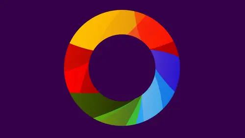
evolution, and this is something we're gonna be talking about. This is the realm of Joseph Albert. So we moved from you wanna sit now to Joseph Albers. Another great quote. Colors present themselves in continuous flux, relative constantly related to change in neighbors and changing conditions. So this is a very typical Albers exercise, and you guys are going to be working on this both with paper and also on the computer on a nap, actually, on IPad. I think you've done some of this, Christine. Haven't you playing around a little bit? Yeah. Does anyone else done any of these kinds of exercises making one color look like to? Okay, so we look at this and we say that the screen looks a lot brighter than that green over there, right? But in fact, it's one color. So again, this is about color relativity. How color changes based on its neighbors. So up here we see these two colors and they look different. This looks darker. This looks lighter. It's in fact, all the same color. So what's happen...
ing here is the process of color subtraction. The outside color is subtracting itself from the inside color in this case, this dark color is subtracting itself, making this look lighter over here late, subtracting itself, making that look a little darker. You actually see that these air two different colors, right? So that's over there. That's over there. It's actually challenge Study color mixture in our imagination, that is to say, with our eyes closed or with closed eyes, this is the illusion of transparency. So we all know if we've worked on the computers that we can do this by dialling opacity. Well, if you try to do it with cut paper, you really are mixing colors with your eyes closed. So this color this mixture color is a single piece of paper. This is three pieces of paper 123 and as a designer, as the artist coming up with this, you're saying we have these two colors pink and green. What is the intersection of thes? Are the parents? What's the child? The child is in between color. We're trying to imagine that color with our eyes closed, more illusions of transparency. Israel done with cut paper, and sometimes sometimes you can actually create spatial illusions where color seem to be emerging and receding dip sticks. Beautiful concertina. So we see the transparency as we move across collage again something you guys are gonna be working with The playfulness and humor and no way detracts from the end result of a serious work of art ball around. So collage is something if you've ever done scrapbooking, Uh, perhaps just played around with something, Maybe made a birthday card for someone you probably have done. Collage, usually with found materials and plush, began with Picasso and Brock. Uh, back at the beginning of the 20th century, they decided to glue pieces of paper to their paintings. Well, at that time, this was pretty revolutionary cause paintings were paintings. They did not have anything glued to the surface, right? So as soon as Picasso decided to glue a piece of paper to his painting, he invented collage. And that were collage. Uh, has to do with this idea of gluing, um and so we see here an example of a collage. Beautiful use of color, beautiful use of materials, all based on found materials. So when we get to collage, then we're deciding on what kind of materials to put together. So here, just like a color grid. It's in the range of greens. We have break rings. We have dull greens, warm greens and cool greens like greens and dark greens, all with found materials, samples of paint, little pieces of foam, sometimes pieces of paint. Newspapers. I also teach typography of the school of visual arts, and these are actually from my type classes and where we're still focusing on color. So we have contrast of light and dark, vivid reds, Dole reds contrast A warm and cool a little collage. It was probably done at Starbucks or somewhere like that. Samples of sugar a map. When you're working with collage, anything goes. The only requirement is restraint. So contrast of light and dark variants of orange. Every person who makes a collage brings their own experience to it. Your own materials. Have you guys done any collage work? No, Christine. Never a little bit. Have you guys ever experimented with plush? Yeah. Christine, what is your experience with collage work? Um, I do a lot of scrapbooking for fun. Yeah, like I like playing with paper and getting my photos down and just putting it all a nice arrangement. Yeah. Yeah. Collage is very much about that found materials, All right. But you were still thinking about color in the same way it would be thinking about color if we're working on the computer or working with color samples that are very pure, like this, usually with collage were working with materials that are have a variance to variation. So variations of texture complained that all this work you're showing is from your students. Yes. Now, clearly, with the collage work, this is either handcuffs in hand, pasted, etcetera. But do they work also in digital collage and digital? What words as well we do, um, and one of the ah, one of the fun things you can do, of course, is make things by hand. Uh, maybe make a painting of, maybe do something with markers or pencils, maybe something with other kinds of materials. Crushed paper, different kinds of powders. You can photograph it and scan it, bring it into the computer and digital collage at that point. So we do work with computers. Usually we're not starting right on the computer. We're starting with some other kind of material, and we're scanning it or photographing and then bring it in it and make dude digital modifications to it. Scrapbooking courses here, a creative life which have bean really wonderful for our audience. And some of them have been very traditional. You know, you get scissors and the glue and all the other fun stuff and others have been completely digital where you're putting it all together. Absolutely, really interesting. The thinking is very much the same. Yeah, And today, with so much of our information and our art being displayed on screen, it makes perfect sense that we are working digitally. Even things that are handmade end up being projected leaves again. We're gonna be in the workshop working with color leaves have come to us from New Hampshire. A Szot, I think, last week, um, are ta. Laura has a friend up there, and she sent us a beautiful a range of leaves. So we'll be working with that colorful leave suit. Always have played imagination for all kinds of order and placement. Therefore, they remain a favorite means of study. This is Joseph Albers now. Albers came from Germany, his first teaching gig, and United States was at Black Mountain College and he discovered, leaves the fact that in the fall right now in other parts of the United States. Here, too, I suspect I'm not familiar so much here. I'm more familiar with New England in the East, but leaves provide us with a means of material. And I love it because leaves are free. They're widely available. Uh, no one can say they don't have any money to buy leaves, which is great. You just go out and pick them up. Now you have to dry them, put them in a book and flatten them out. And then he looked like this. This is Ah, leave collage that I made 2004. And this is what it looked like when I made it. And it's a simple expression of complementary colors, green and red, and you can see how when I chose this is actually colored paper, the same stuff that's on the table here. So we have a green in the background in this red orange on top, and the greens of the leaf are actually assimilating into the green ground so you don't see the edge leaf down here where at the very top. But then there's a lot of contrast against the red so down here. Low contrast appear high contrast. This is what it looks like now. So one of the great things about leave collages is that they change. We can actually see them change. So over the course of all these years, that leaf has actually become the color of this background, which I put in later. It's a piece of cardboard. I actually have this with me and we'll be looking at this later in the workshop. The actual physical thing, Another beautiful leave collage made by one of my students. Contrast of light and dark. A grid to color grid made with leaves, one of the most beautiful leave collages I've ever seen. Little typography thrown in leaves are organic shapes, and when we get to the part of the workshop where we're starting, organic composition are composition with organic forms. Leaves will be our materials. Usually when we make leave, collages were combining them with other kinds of materials. This, by the way, this idea of tearing paper so we can cut paper with a scissors or an Exacto knife. But we can also tear it, which creates this beautiful, irregular kind of edge. What I call an organic edge, the texture. So when you see Leaf, you might be inspired to use a certain kind of material with it, based on the properties of the character. Six of that leaf. This is really beautiful work, which have easily is being painted as well or thesis the actual color of the league. In most cases, these are actual cover to leave the stunning, and they probably don't look this way anymore. Now, actually, is there a way of preserving the color once you've actually made sure you can coat them with a sealant like much podge or some of the kind of a varnish? And that will definitely protect leaves. If you want to do that, I actually like the idea of them changing. I think it's kind of interesting. Once they're flattened, they don't really curl up anymore. And if they're glued down with a good solid blue, they'll say flat. But most of these photographs, aside from the 1st 1 I showed you of my own leaf collage, were taken, Uh, as soon as the leaf closures were made, so they're very fresh color wheels. We're not actually going to be doing physical color wheels in the workshop, although you will always be referring to color wheels. It's one of the things I enjoy most in my teaching, and so I'm gonna show you a lot of examples. Color wheels made with found objects, these air all caps and pencils. And if you remember back to the color wheel I showed at the top of the segment. You can follow the colors around so from yellow to yellow, green to green to blue, green to blue in the background. Two blue violet, violet to red violet toe orange, yellow orange back to yellow. This is great quote from pain Bon Gertie, who is, by the way, a philosopher and a poet but also a color theorist from the 19th century And back then, uh, you know, people weren't so specialized. They could do all kinds of things. Often times, we combine color wheels with grey scales, and so here we have contrast of light and dark, expressed in a monochromatic way from light to dark. Over here we have the color wheel, also expressing contrasts of light and dark. So we have lighter colors, darker colors done with a woven construction, and also you see the scale of it. So some of these things tend to be very monumental. Yes. So could you go back to that last image? So you talked about the 70 for contrast in the 1st 3 were light and dark, warm and cool. Vivid indulge. It seems like sometimes, like this is a great illustration. I have a hard time distinguishing between on the color image. Is that a contrast of vivid and dole? Or is it or is it lightened dark? It seems like sometimes they kind of they kind of go together. How do you think about that? Typically with these color wheels were not thinking about vivid and dull. We're trying to go for the purest colors possible. And so here all of these colors are very vivid. All right, um, there's no real dull colors there. Now. You can de saturated color by adding lightness or darkness to it, but it's very different, the different way of thinking about vivid and dull. So when we're talking about color wheels, we're really talking about light and dark. Yellow is light purples, dark, also talking about warm and cool right oranges. Warm blue is cool, were really thinking though, about color relationships and how colors are related to each other based on their identities. So green is a mixture of yellow and blue. Orange is a mixture of yellow and red. Purple is a mixture of red and blue, and that's what the color wheel really gives us. It's a color system. That's a good question. Now, every time I teach this assignment, I get different results. This is actually the work of, ah, guy that we're gonna be talking to it in the workshop, one of our guests, something he did as a freshman. And so you'd be able to compare this to Hiss now professional work, which would be kind of interesting. So we see the primaries in the center, and then the secondary color is orange, green and purple on the outside. And then out here in the corners, we see the primaries again, with light and dark variants of each very interesting, very beautiful, very strategic design. Here's a painted color wheel with very pronounced primaries red, yellow and blue, the other colors reduced down. Now here we do see vivid and dull, but this is kind of a rare case. Beautiful color wheel very complex. It's at the gray scale in the centre, contrast of light and dark and then surrounded by the 12 colors of the color wheel. And out here on the perimeter, we have the colors as you can see them. So yellow, yellow, green, blue, green, etcetera all the way around. And then here we have light and dark variants of each of the colors, and they're arranged in their complementary relationship. So purple is a complement of yellow, uh, blue green. It's a complement of red orange again, kind of an ingenious design. Here we have one of those strange. I'm not quite sure what I'm looking at kind of thing. Is it projecting forward or backward coming at me, going back in space? Really beautiful. But it's all done with contrast of light and dark, in addition to the color wheel contrast and then the great skill in the center. So we see dark variants of yellow dark variants of orange light variants of orange light variants of yellow, another really beautiful expression of the color wheel. This is painted on a piece of plywood, 12 circles, all overlapping. We see all the variants all the different combinations of colors. There's something actually done with feet. One of my students, Carlos, painted his feet and the toes air. The compliments. Really fun. These are often done with sketches first, so maybe you start off with pencils or markers. Maybe you cut little pieces out of paper and make arrangements, and then the execution happens. Actually done with rubber stamps? It's hard to tell, but that's a uh, maybe it's not hotel. It's a woman and all the heads and the arms air right in here, which is this great combination of all the colors, All 12 colors. Typical color wheel with this great combination in the center that looks like some kind of strange fruit, something married with a square punch. Sometimes color wheels could just be made with slivers of color cut from magazines. There's one a QR code, one of my favorite parts of it. I love this beautiful gradation of warm to cool with these colors, but I really love these little gray scale great studies that are in the corners, and it's, ah, again looking at a common object, something we see every day, the QR code and thinking about it as a form of a color wheel. Here we have a little logos, corporate logos. So we see how corporations companies all have hero colors here, arranged in a sense of a color wheel. And here we have the inside of, Ah Chinese Checkers Game Board and that used as sort of a model for creating a color wheel system. So each of the six points are the primaries and the secondaries that we have bred yellow and blue, um, green, purple and orange. So those of the primaries and the secondary colors with variants in each quadrant and then right in the centre. It's hard to see, but there we have the three primaries and the secondaries. You're it's used as a decorative, um, aspect for this beautiful box. And here is a clock with found objects. Rocks. Have any of guys made color wheels, but you've all studied color wheels. I'm sure at some point in your life, grayscale in the middle, beautiful colored rocks going around the outside, and this is really not a color wheel. But I think it's a really beautiful expression of all the colors of the color wheel arranged in this kind of a badge composition, but we got some great questions coming. Go online. If you'd like to take some Richard that fantastic audience, absolutely. Now this one's bring very popular. Six people have voted on this. And don't forget, you can vote on questions as you see them. Al Blanco is saying the color pink doesn't actually exist. Is that true? And can you explain why pink is a light version of red? That's really all it is. I don't know if I would go so far to say it doesn't exist, especially people who like pink. Um, a lot of young people might think, but not just young people. Um, so, uh, but if you think about pink, pink is a light color. We will say that although there are dark versions of Pinkas, well, there are dull versions of pink. There are bright versions or vivid versions of pink, but pink is basically read with a little bit white added to it. And if we look at our colors here, we can certainly find examples of you know what you might get to their pink like this. Not sure if that look pink to everyone, but it's a light version of red. It's a lighter version of something like this. I mentioned this at the top of the segment, and I know this is something judging by the Q deck that a lot of people having issues with. And it is about color blindness on how people have different challenges. Differentiating Sam is saying, I've ever designer was working with or four color blind people. How would they employ color theory to improve their work for that audience? That's a deep question, perhaps a little bit too soon. If you have any thoughts on that, I mean, is that something will be talking about in this course, Probably not too much. Um, I'm I'm not a scientist, and I don't really know that much about it. I can't profess to be an expert in it. What I do know is that contrast of light and dark certainly is important to people who have any kind of, uh, you know, a way of a different way of seeing color. So if you don't see a particular color, chances are you will see something that's either light or dark. And that's one way of of thinking about color. If you if you can't see a particular color. You can still see it as later dark. Maybe some of the other contrast might also be employed vivid and all. Um but it does bring us to an interesting idea. You know, something I talk about with students all the time in terms of how colors are used in our everyday life. And two colors red and green are used every day. We see them every day. A traffic lights right. So the red is on the top, the greens on the bottom and the yellows in the middle. Does anyone have an idea why those colors he used Take a guess. There's contrast, right. So red and green are compliments of each other. Their contrast e front, very different, right? The interesting thing about red and green is they have the same exact light value. Now, this is a dark green, and this is a fairly pure red. Maybe if I find a different green here might be a little bit better. Like this is a little bit of a yellow green, but when used in equal amounts, they have the same exact light value. So if you think about a traffic light, you don't want one the lights to be brighter than the other. You just want them to be different. So red and green accomplish that that the same light value. And so when their projected out toward us in a traffic light ones not going to seem brighter than the other. But they both communicate a particular idea in a very profound way. We know that this color means go in. This culture means stop now. If we were using purple and yellow, for example, and yellow was stopped and purple is go, purple will be much, much darker. Yellow would be much, much brighter, so those colors wouldn't have the same kind of value equality to them. It's gonna fascinating yellow in between. I think it's just a another, Uh, maybe they use call. I've never really even thought about this, but perhaps the yellow in between is really meant to say, Hey, you better start slowing down. You know it's gonna change, and immediately and so it's really meant to grab our attention, continue my color. It's We're really going into the history of color. But when I think about students work, uh, it's part of the continuum of color from cave paintings to color wheels. I think a painter's all right, and there's recently been in some interesting K opinions in the news. Some interesting things found out 40,000 years ago, 50,000 years ago, when the first cave paintings were made. Those people were playing. They were playing with color. Now they were getting their colors from the earth, and they were projecting them on the wall. Sometimes you'll see if you go to, Ah, a Wikipedia, citing. You just Google K paintings. Go to Wikipedia. You'll see some great examples. One of the favorite things for K painters is to put your hand on the wall and to spray paint around your hands so you have a stencil and you'll see these things in their hand. Prints all over and some handprints air light, some dark. Sometimes the background is dark in the hand is light. Sometimes the reverse the hand is dark in the background is light, so they were clearly playing. Now we don't know. It may have been ceremonial. If you guys have any experience with K paintings or not, I have ever seen them. I've actually never seen them in person I'd love to, um, but idea of using color to distinguish a form and to think about color Contrast is a way of distinguishing forms was clear to these people back then. So all the way from K paintings to color wheels, it's a continuum of color. And I just put together a few things here about the history of color to in ancient Egypt. We had all this symbolism. So white was thesis immobile of purity, sacredness and simplicity. Black facility. Resurrection, regeneration, Silver. The Dawn Son Moon and Stars blue. I'm on the creative the world, the god green for healing and wellness and read the opposite of black and white chaos disorder, also the symbol for life. Just in a way, if you think about chaos and disorder, that's pretty much my life in ancient China is. Yellow was a symbolic color of emperors, but colors were also associate with elements. So gold, earth, center of life, black water, the color of heaven, the sky black fire, good fortune enjoy would make sure and renewal bluegreen and gold purity. So white was a symbol of gold impurity, so they were thinking about colors as symbolic things. Aristotle who knew he desired. Devise a system of colors based on the colors that we see during the day from white two yellow or gold, red, purple, green, blue from the morning until the night. Divinci took that idea and reduced it to six colors and spectral order. So we're getting closer to the idea of a color wheel. This is the renaissance. Now. Keep in mind that each time we talk about the history of color, we're also talking about technology. So the cave painters had the colors of the earth right at the elements toe work with, so their colors are mainly browns yellows. We get into Egypt and China. There again, they're working with colors based on what was available to them. Same thing with Leonardo. Not all the colors had been stabilized in some kind of a pigment yet, so we don't see any purple there. Isaac Newton, most of us know, as of noon for other reasons by Isaac Newton was a colorist. He was the guy who projected light through a prism based on his observations of the rainbow and discovered. Basically, that light is color and that we can actually see colors. Uh, based on lighting conditions. He toes seven. So 123 revising seven. Red, orange, yellow, green, blue, indigo and violet. And he did this in order to make a relationship to an active. And again, you know, back then, people were always trying to find associations between things. So color and music again, kind of going forward, something I'm interested in. There's his diagram, and if you follow it around on the outside, you see orange associated with the note e yellow, green, blue. There's into Go and violet and red and the musical notation that follows that there. It develops a color wheel composed of the primary and secondary colors, and this came of a few decades later, and it was kind of in a response to Newton. He was the one of the first, although not the first, to arrange to make a color wheel that had the primaries and the secondaries arranged opposite issues. Other. So there's a complementary relationship like this. This is the color wheel were all very used to, and it comes to us through Gertie. There we see the rainbow beautiful photograph taken by my niece up in Oregon, but we see this all the time, and that's the color spectrum. That's the color wheel. So we have Isaac Newton. We have got a we have. It brings us to this. It's the continuum of color, and that's kind of where we're at now. No idea. Newton had any input into this whatsoever, so I've learned something already. He's the guy exciting. There's no doesn't limit to his genius. Clearly, I knew I knew about, you know, he must have invented pumping because if you push in one direction and you go in the other than that has to be well, I guess color was just one of his things. It's this. The only reason I know him, for example, because you know, dropped out of science very early, along with mathematics. Maybe, like some of us, I don't know. And there's just a Wikipedia site. If you want to try doing a little research on your own, it's always a good example. You can go to Wikipedia research color wheels and you'll get some really good ideas, and then quickly just a colored design glossary and these air terms that we're going to be using throughout the day so very quickly this is not elaborate. You can just start to think about these things. Thes words Que, uh, probably one of the most misunderstood terms that is associated with color. Uh, and computer technology has a little bit to do with that, but a hue is really the identity of the color. So when we talk about a hue, we say a red hue and, ah, a red hue has many variants, many colors of red. So we have light reds and dark reds and warm reds and cool reds. They're all the same, Hugh, but different colors. And that's true for all colors. All colors have a hue, green hue of blue hue and orange. You, but they're going to be lighter, dark, warm or cool, sometimes vivid and dull. Tint. A light variant of color shade, a dark variant of color. So if I say shade means dark, if I say tent means light. And actually that's Color AIDS way of talking about color. But it's a pretty good one. You know, something we can all easily. Yeah, it's you, the just the primary color that one of the choices, Or is it all the all that comes with all the colors. So if you think about well, you know, I guess you can say it's It's the six colors of the three primaries in the three secondary. So of red is a hue. Red issue green issue blue issue. But think about Hughes as being like the big umbrella that contains, or the bucket the canes, all the variants of red, all the variants of green. Those are all green hue or all red hue, temperature warm and cool. We've talked about that saturation, vivid and dull, and value values a tricky one. Uh, it's important, though, and what value is is the intensity of a color, the importance of a color, the effect of a color and a composition. All right, so what color can have a very strong value, but it's always based on its association, its neighbors. But when I talk about when we start to look at your color grids and your compositions, I might say that color has more value than this color, and I'm really talking about its importance relative to its other colors. And here this is actually just the color spectrum from Illustrator. That's what we see when we see the color palette and illustrator, and it's a great demonstration of those color contrasts. So, first of all, we have Hughes red hues. See all the different reds, these air, all the hue of red right and also right over here on the edge so a red can be dark or light. It could be a vivid, dull dollar. Reds, greenish yellow greens. So this is the hue of green, the hue of blue hue of violet like variants, dark variants, tints and shades warm and cool. So as he passed through from warm to cool back toe warm. And there's a color contrast again. Contrast of hue, light and dark, warm and cool, vivid and dull. Complementary. Contrast the color wheel proportion. Now Johanna Sitting uses the word extension to talk about proportion. I'll explain that more when we get to the color grids, and then we have the same simultaneous contrast, which is again kind of a tricky thing. It has to do with color illusion how one color can look different based on its surrounding neighbors. Do you guys have any questions at all about any of these things? Anything that just is a total mystery and you just go on and want to leave the room because it's so crazy and you don't want to talk about it. Yeah. Guarantee will understand all these terms. Glossary at the end. Yeah. Okay. All right. So I still, um, a little bit about this earlier, but I'm still trying to hone in on it. So I have a little bit of a difficulty understanding the difference between the light and dark contrasts and the vivid and dole contrast to really good question. They're very similar. So light and dark is a way of de saturating color eso depending on context, you can have, you know, light could be vivid and dark could be dull. But you have to understand that you can have a light color that's dull, and you can have a dark color that's vivid. And that is the difference. So light and dark just refers to its light. Value is a light color. It's a dark color. This is a light color, but it's also very vivid. All right, this is a dark color, right? It's also pretty vivid. You know, some of these pastels over here gray is a great example of color that Ah, very de saturated. Very dull. Yeah, that's another good way to think about. Vivid and dull is the purity of a color. How, How much, how how clear is the identity of the color? So we can clearly all agree those of us who can see this is this is red. It's a very vivid red, but here we say gray, and it's the absence of red right? So it's a dull, its de saturated, vivid and dull again, you know I had. This is a question that always comes up. How do we distinguish between light and dark in vivid and dull? And if you just think about that idea that a light color can be vivid or dull, and a dark color can be vivid adult. But that's not true for light and dark, right? It's a way of talking about colors coming from Julie on life, she's saying. Can I think of dull in the terms of adding more black or white to a color? Absolutely. Or adding its complement? Yeah, so you can dull down, read. By adding green, you can dull down read by adding white or black. Adding white or black will also make a lighter and darker right, and maybe the same is true for green. But I think it's more a matter of saturation that there's one color wheel that you showed that. Actually, I think of being hand painted. Where it looked to me is anywhere, if black of being added to the some of the colors to make the outside very dark. It could have been black, but, uh, depending on how was pain. And I don't remember that particular one. I remember the peace, but I don't know how it is. I am a time you could add the compliment to it in order to darken it up. Now I'll teach. Assistant here is as Christine, Christine, anything you'd like to share with us from this bit from this first segment from this introduction from your thoughts Really Well, I saw a lot of all of the examples of the projects and I was writing down like I want to try that, like I'm going to try that grid when I get home. So I'm pretty like the great thing about looking at work and seeing examples and seeing things that you want to try. Yeah, every time I go to a museum every time I go to a gallery. I get ideas about color and knowing something about color three and enables me to say, OK, I'm going to try that. I think I know what that artist is trying to do here. So it's not simply a matter of saying, Oh, I like those colors. I'm going Teoh appropriate that pallet for my own use Maiken sale. That's contrast of light and dark. Or that's contrast of warm and cool with those particular color variations. It really becomes kind of interesting, and it's fascinating. Once you understand color theory, you can really see colors in art. It becomes really clear with people are doing And, uh, it simplifies art in a way, it enables us to understand it more easily. And I didn't really say this at the top of, but you want to sit in was all about this. He he devised ah, teaching method that enabled us to break down these ideas toe, understand them and very easy ways. So you know, every single painting or a photograph or a movie, uh, something we see on television. We see colors and were always very very aware of them, but we're not really thinking about say how the designer or the photographer was thinking when they made them and maybe they weren't even necessarily thinking about it. Maybe it was more of an intuitive thing, but I like the idea of breaking it down. It's kind of like learning how to play a game. You know, you you dribble a basketball and at first you dribble it one way and then you dribble it behind your back and then you go through your legs, and each time you do this, you learn more about it, and the same thing is true for color. So we become more aware of it. We are our confidence develops. Eso were not so necessarily tied to the colors that we're comfortable with. Staying within our comfort zone, were able to move outside of that and unable to employ these ideas as if they're a creative toolkit.
Class Materials
bonus material with purchase
Ratings and Reviews
Nabha
The course was great. Richard was a very good teacher, appreciating the students’ work and helping them expand and improve on it. I learned from that alone. I feel more confident in choosing colors, and hope to bring a greater sense of fun to my design work. Thanks again.
PETE
How wonderful to have such an experienced, thoughtful teacher, who takes educating others so seriously. The depth and breadth of his teaching skill is matched by his knowledge of the subject. I studied art in school, own some of the color books he recommends, and learned far more than I thought possible. And he does it all in such a kind, affirming, supportive way. What a calm guide. How lucky are we to have access to a class with him!
Joe Loffredo
I was concerned that I wouldn't like watching everyone work, but I found that it was the best part! It allowed you to see Richard's lessons being put into action by the various students, each of which is talented in their own right. And Richard is great. Knowledgeable, intelligent, and supportive, he's got the attributes a great teacher should have. I'm a painter, not a designer, but the class really helped me a lot. When I go back to the canvas, it will be with a much deeper understanding of color, and how colors interact with each other.